
From Complexity to Clarity: Scaling Innovation through Modular Design Systems

By Brand Strategy, User Experience

"It’s incredibly powerful: if you can figure out how to use it."

Have you heard someone say this about your product? Have you said it yourself?

There’s no getting around it: visionary ideas are often complicated. When you’re building something that’s never been done before: especially in high-stakes industries like ag-tech or data science: complexity is the default setting. But here is the hard truth: If your users can’t navigate your innovation, your innovation doesn't exist to them.

Many businesses fall into the trap of believing that "more features" equals "more value." In reality, the opposite is often true. Every extra click, every confusing menu, and every inconsistent button adds friction. And friction is the silent killer of growth.

The good news is that you don't have to sacrifice power for simplicity. You just need a better system.

Table of Contents

  1. The Friction Problem: When "Powerful" Becomes "Painful"
  2. The INTENT Story: From Dev-Led to User-Centric
  3. What is a Modular Design System?
  4. Decision Design: Our Philosophy for Removing Friction
  5. Scaling Innovation: How Design Systems Fuel Growth
  6. Why Brand Alignment Starts with the User Interface

The Friction Problem: When "Powerful" Becomes "Painful"

Have you ever felt like your digital product is holding your business back?

It’s a common scenario for technical founders and established organizations alike. You’ve spent years perfecting the backend. The data is accurate. The logic is sound. But the interface? It looks like a cockpit from a 1970s jet.

Illegible does not equal inventive.

When a product is "dev-led," it often prioritizes how the machine works over how the human thinks. This creates an administrative burden that drains resources. Your team spends more time on support calls and training than they do on actual innovation. Complexity is a tax on your growth.

As a digital product design agency, we see this friction as the primary obstacle between a great idea and a successful market leader. To remove it, you have to move beyond just "fixing the UI." You have to redesign the way decisions are made.

The INTENT Story: From Dev-Led to User-Centric

Let’s look at a real-world example: INTENT.

Based in the Midwest, INTENT is a powerhouse in the ag-tech space. They built a sophisticated research tool designed to handle massive amounts of agricultural data. It was, by all accounts, a technical marvel. But there was a problem.

The tool had been built by developers, for developers. It was dense. It was complex. It was difficult to navigate for the very people who needed it most. Instead of being a seamless part of the workflow, the software became a hurdle.

They came to ZIV because they knew that to scale, they needed to transform this technical tool into an intuitive experience. They didn't just need a website design and development agency; they needed a partner in creative consulting who could translate their technical vision into a human-centered reality.

The goal wasn't just to make it look better: it was to make it work better.

What is a Modular Design System?

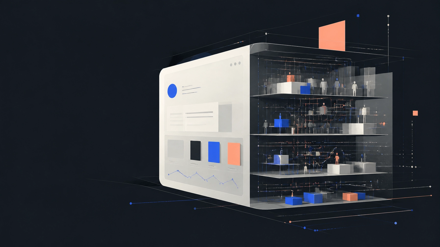
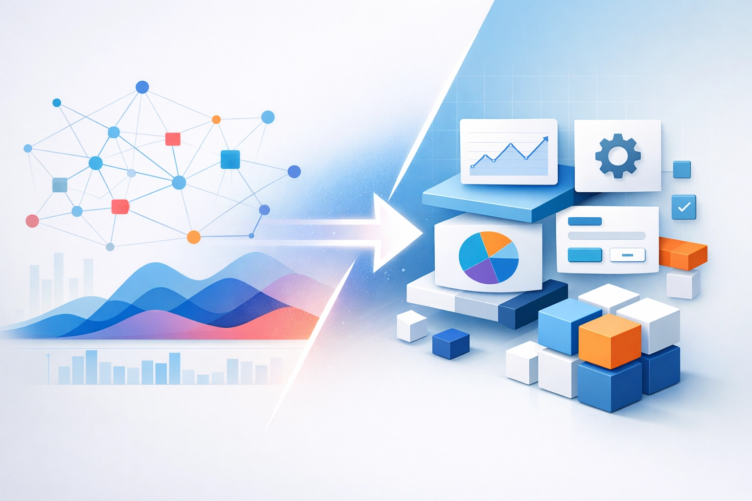
How do you take a massive, complicated system and make it feel simple? You break it into pieces.

A modular design system is a collection of standardized, interchangeable components that can be used to build a digital product. Think of it like a set of LEGO bricks. Instead of building every new page or feature from scratch, you use a library of pre-approved, pre-tested parts.

Standardized modules allow you to move faster without breaking things.

According to our research into high-growth tech firms, modularity addresses complexity by decomposing systems into basic modules. This standardization allows different production processes to occur simultaneously.

  • Speed: You can develop, test, and scale individual modules independently.
  • Consistency: Every part of the product feels like it belongs to the same brand.
  • Flexibility: As market demands change, you can reconfigure your "bricks" without a total redesign.

Yet how can you be sure those pieces actually solve the user's problem? That’s where the design process comes in.

Decision Design: Our Philosophy for Removing Friction

At ZIV, we don’t just "design." We use a philosophy we call Decision Design.

It’s about identifying every point where a user has to make a choice and ensuring they have exactly what they need to make it: no more, no less. For INTENT, this meant a deep dive into the user journey.

We didn't start with code; we started with clarity.

Our process involves several key stages:

  1. Mood Boards: Establishing the visual "vibe" that aligns with the brand’s professional yet innovative identity.
  2. User Flows: Mapping out the exact path a user takes to complete a task. Where do they get stuck? Where do they feel overwhelmed?
  3. Experience Maps: Visualizing the emotional journey of the user.
  4. Prototyping: Building a low-fidelity version of the system to test our assumptions before a single line of production code is written.

By iterating through these stages, we were able to strip away the "noise" of the old INTENT tool. We replaced it with a clean, intuitive interface that felt like a natural extension of the user’s thought process.

The result was a design system that wasn't just pretty: it was functional.

Scaling Innovation: How Design Systems Fuel Growth

Scaling a business is hard. Scaling a complex technical product is even harder.

Without a modular system, every new feature you add makes the product exponentially more difficult to maintain. You end up with a "Frankenstein" product: bits and pieces tacked on over time that don't quite fit together.

A modular design system turns innovation from reactive to proactive.

When INTENT adopted their new system, they didn't just get a better-looking tool. They got a growth engine. Because the components were reusable, they could prototype and test new features in a fraction of the time.

Even better? Consistent quality is enhanced. Because each module is designed and tested independently, you ensure optimal performance for every component. You no longer have to worry that a small update in one area will break the entire system.

Why Brand Alignment Starts with the User Interface

Many people think of a branding agency as the folks who pick your colors and design your logo. While that's part of it, true brand alignment goes much deeper.

Your brand is the promise you make to your customers. If you promise "innovation" and "ease of use," but your digital product is a confusing mess, you are breaking your brand promise every single day.

Your UI is the most frequent touchpoint your customers have with your brand.

By investing in a high-quality design system, you ensure that every interaction reinforces your brand values. Whether a user is looking at a data visualization or an account settings page, the experience remains consistent. This builds trust. And in a competitive market, trust is the ultimate currency.

Want to know if your current setup is helping or hurting? You might want to ask: How to know if it's time for a website redesign?


The Road to Clarity

Moving from complexity to clarity isn't an overnight process. It requires a shift in mindset: from focusing on what the technology can do to what the user needs to do.

But the rewards are worth it. By removing friction through a modular design system, you:

  • Reduce the administrative burden on your team and your users.
  • Accelerate your time-to-market for new innovations.
  • Strengthen your brand alignment across every digital touchpoint.

You’ve built something powerful. Now, let’s make sure people can actually use it.

You're on the road to a more intuitive, scalable future.

Sounds a bit daunting, doesn't it? It doesn't have to be. Whether you are looking for a digital product design agency to overhaul your core tool or a partner for user experience strategy, the first step is simply acknowledging that the friction exists.

Let us know! We love talking about how to turn complex systems into clear, actionable designs. If you want to see the full transformation, check out the INTENT case study to see the "before and after" for yourself.

The Executive’s Guide to Decision Design: Why Your Website Should Do More Than Look Good

By Digital Experience, Experience Strategy, User Experience, Web Design & Development

"Our website looks amazing, so it must be working."

Have you heard someone say this? Have you said it yourself? It’s a common sentiment in boardrooms and marketing meetings across the country. There’s a certain pride that comes with launching a sleek, high-end digital presence that garners "oohs" and "aahs" from the internal team. But there’s a hard truth we need to address right out of the gate.

A beautiful website that doesn't drive a specific business outcome is just an expensive digital paperweight.

There’s no getting around it: the digital landscape has shifted. In the early days of the web, having a site was about "presence." Today, for visionary entrepreneurs and executives, it’s about Decision Design. Your website shouldn't just exist to tell people who you are; it should exist to lead them exactly where they need to go.

Table of Contents

  1. The "Digital Brochure" Fallacy
  2. What is Decision Design?
  3. The Role of a Modern Website Design and Development Agency
  4. Removing Friction: The Silent Killer of Conversion
  5. The ZIV Approach: Fusing Strategy and Tech
  6. Is Your Current Site Creating "Choice Overload"?

The "Digital Brochure" Fallacy

For years, businesses treated their websites like digital brochures: static, passive, and purely informational. You listed your services, added a "Contact Us" page, and hoped for the best.

Yet how can a passive tool survive in an active market?

If your site is just a collection of pretty pictures and corporate jargon, you are leaving money on the table. A high-performing website is actually your most consistent salesperson. It’s working 24/7, across every time zone, speaking to every potential lead. If that salesperson is just standing there looking "pretty" but not closing deals or guiding the conversation, they wouldn't stay on your payroll for long.

Often overlooked is the fact that users today are impatient and overwhelmed. They aren't visiting your site to admire the color palette. They are there because they have a problem, and they are looking for a solution. If your site doesn't immediately signal how it solves that problem: and what the next step is: they will bounce.

What is Decision Design?

At ZIV, we talk a lot about the fact that the best branding agencies don’t just design logos; they design decisions. This philosophy extends directly into our web work.

Decision Design is the intentional process of removing cognitive friction to guide a user toward a desired outcome.

It’s the intersection of behavioral psychology, user experience (UX), and high-level engineering. When we build a site, we aren't just thinking about where the buttons go. We are thinking about the state of mind the user is in when they click them.

  • What are they afraid of?
  • What information do they need to feel secure?
  • What is the absolute smallest next step they can take?

A blue path guiding a user through complex structures, illustrating Decision Design and a clear user journey.

The Role of a Modern Website Design and Development Agency

When you are looking for a website design and development agency, you aren't just looking for someone who knows how to code in React or manage a CMS. You are looking for a partner who understands your business goals.

Many agencies can build a site that functions. Fewer can build a site that performs. A strategic partner will ask you about your sales cycle, your lead quality, and your long-term vision before they ever open a design file.

The good news is that when strategy and technology fuse, the results are measurable.

Take, for example, our work with Lead Bank. We didn't just give them a "new look." We built a digital experience that reflected their innovative approach to banking. The result? The Lead Bank experience won Website of the Year, not just because it looked good, but because it transformed how their clients interacted with them online. You can read more about that specific launch here.

Removing Friction: The Silent Killer of Conversion

Sounds a bit daunting, doesn't it? The idea that your own website might be working against you?

The most common culprit is friction. Friction is anything that makes the user stop and think. In the world of web design, thinking is usually bad. You want the experience to be intuitive: so natural that the user moves through the funnel without ever feeling like they are being "sold" to.

Friction looks like:

  • Confusing Navigation: If a user has to hunt for your services, they’re gone.
  • Too Many Choices: Paradox of choice is real. Give someone ten options, and they’ll choose none.
  • Slow Load Times: Even a two-second delay can tank your conversion rates.
  • Lack of Accessibility: If your site isn't inclusive, you are literally locking the door on a segment of your audience. (Not sure about this? Check out what website accessibility is and who it's for).

Word to the wise: Illegible does not equal inventive.

Sometimes, agencies get too "creative" and break standard UI patterns. While it might look cool on a portfolio site, it frustrates the actual user who just wants to find a phone number or a price point.

A sphere gliding on a smooth track, symbolizing a frictionless user experience in strategic website design.

The ZIV Approach: Fusing Strategy and Tech

As a creative consultancy, ZIV approaches web development differently. We don't see design and dev as two separate departments; we see them as a singular, iterative process.

1. Discovery & Strategy: Before a single pixel is moved, we dive into the "why." We identify the key decisions your users need to make and map out the path of least resistance.
2. Wireframing for Flow: We focus on the skeletal structure. Does the story make sense? Is the hierarchy clear? We don't move forward without a formal wireframe approval because the foundation is everything.
3. Visual Identity: This is where the "pretty" comes in: but it’s beauty with a purpose. We use color, typography, and imagery to reinforce the brand's authority and emotional resonance.
4. High-Performance Engineering: We build for speed, security, and scalability. Whether it’s marketing automation or custom integrations, the tech must support the design, never hinder it.

But did you know that the best websites are never truly "finished"?

The digital world moves too fast for a "set it and forget it" mentality. We believe in continuous optimization: using data to see where users are dropping off and adjusting the "Decision Design" in real-time.

Is Your Current Site Creating "Choice Overload"?

Have you ever felt paralyzed by a massive menu at a restaurant?

That’s exactly what happens to your customers when your website tries to do too much at once. An executive-level website should be an exercise in restraint. It’s about knowing what to leave out just as much as what to put in.

If your site hasn't been updated in a few years, it likely suffers from "feature creep." You’ve added a popup here, a new service line there, and a blog category over there. Suddenly, the clear path you once had is covered in digital weeds.

How can you know if it's time for a website redesign?

There are a few tell-tale signs:

  • Your bounce rate is climbing despite high traffic.
  • The site feels "clunky" on mobile devices.
  • Your team is embarrassed to send the link to high-value prospects.
  • It takes forever to make simple updates.

If any of these sound familiar, you're on the road to a digital plateau. You can dive deeper into this in our guide on how to know if it's time for a website redesign.

Chaos transforming into an organized chart, representing strategic data-driven website redesign and focus.

Building for the Future

The websites of 2026 and beyond aren't just about information; they are about interaction. They are about creating a seamless bridge between a user's need and your solution.

As a business leader, your job isn't to know the nuances of CSS or the latest SEO algorithms. Your job is to ensure that your digital presence reflects the quality and vision of your company. You need a site that doesn't just look good in a browser but looks good on a P&L statement.

Your website is an investment, not an expense.

When you treat it as such: and focus on the principles of Decision Design: you stop chasing clicks and start building relationships. You move from being a "vendor" in the eyes of your customer to being the obvious, intuitive choice.

The task seems big, but it doesn't have to be overwhelming.

Working with a dedicated website design and development agency like ZIV means you have a partner who handles the complexity so you can focus on the vision. We bridge the gap between "what looks cool" and "what actually works."

Want to see how we’ve helped other visionary brands navigate this? Check out our blog for more insights or browse our web design and development category for deep dives into our technical process.

Let us know what you’re dreaming up. Whether you’re looking to overhaul a complex legacy system or launch a brand-new digital experience, we’re here to make sure your website does exactly what it's supposed to: drive results.

Ready to turn your website into your best salesperson? Let's chat.

Beyond Aesthetics: The ROI of Customer Experience Design

By Digital Experience, Experience Strategy, User Experience, Web Design & Development

"Design is just about making things look good, right?"

If you've heard that before, or maybe even said it yourself, you're not alone. For decades, design has been relegated to the "aesthetics department," treated as the finishing touch rather than the foundation. But here's what two decades of work as a creative consulting agency has taught us: design isn't decoration. It's a decision-making tool that directly impacts your bottom line.

When we talk about customer experience design, we're not talking about prettier buttons or trendier color palettes. We're talking about eliminating friction in every interaction a customer has with your brand, and that friction? It costs you money.

The Real Numbers Behind Experience Design

Let's get specific. Companies that prioritize customer experience report 1.7x higher revenue growth and 2.3x greater increases in customer lifetime value compared to those that don't. That's not marginal improvement. That's transformational growth.

Customer journey dashboard showing revenue growth and lifetime value metrics through experience design

But it gets better. About three-quarters of consumers globally say they'll buy more, and buy more often, from brands that consistently personalize their interactions. Over half are willing to pay a premium for exceptional service. That means better profit margins without requiring volume increases.

So why do so many businesses still treat CX design as optional?

Because the connection between design decisions and financial outcomes isn't always obvious. A confusing checkout flow doesn't announce itself as lost revenue. A cluttered navigation doesn't scream "reduced lifetime value." Yet that's exactly what they cost you.

Decision Design: The Philosophy That Changes Everything

At ZIV, we've spent over 20 years refining what we call "Decision Design", the practice of removing friction from every decision point in the customer journey. Not just the decision to purchase, but the decision to explore, to trust, to return, to recommend.

Every interaction is a decision opportunity. Every piece of friction is a decision barrier.

Think about the last time you abandoned a shopping cart online. Was it the product? Probably not. It was the seven-step checkout process, the unclear shipping costs, the mandatory account creation. Small frictions that compound into big exits.

As a digital product design agency, we see this constantly. Businesses invest millions in marketing to drive traffic, then watch that traffic leak away through poorly designed experiences. It's like filling a bucket with holes in it, you can keep pouring, or you can fix the bucket.

Where Design ROI Actually Lives

Revenue Growth Through Seamless Conversion

One fast-casual restaurant chain boosted satisfaction scores by 34% and achieved 4% revenue growth in a single year. Their secret? They focused on service speed and personalization, two friction points that were creating decision barriers for customers.

When you eliminate friction in the decision-making process, conversion rates rise naturally. Customers don't need to be convinced; they need to not be confused. Clear pathways, intuitive interfaces, and anticipatory design remove the mental effort required to say "yes."

The result? Businesses investing consistently in customer experience report up to an 80% increase in revenue. Not through aggressive sales tactics, but through friction elimination.

Before and after comparison of cluttered versus streamlined customer experience interface design

Retention: The Compounding Return

Here's where it gets interesting. Two-thirds of companies focusing on customer experience design report increased retention, while 60% see a boost in customer lifetime value.

Retention is the multiplier effect of good design. When customers don't have to fight with your product or service, they stick around. When they stick around, their lifetime value compounds. When their lifetime value compounds, your cost of acquisition drops relative to revenue generated.

A customer retained is worth exponentially more than a customer acquired.

This is where creative consulting becomes less about making something beautiful and more about making something irresistible to keep using. We're designing for the long relationship, not the first impression.

Cost Reduction Through Intelligent Systems

While everyone focuses on revenue growth, the operational cost savings from smart CX design often go unnoticed. Yet they're substantial.

One North American cable provider was spending $23 million annually trying to retain dissatisfied customers, each worth only $1,920 per year. That's a staggering example of how poor customer experience inflates operational costs.

Good design reduces support volume. When interfaces are intuitive, complaint rates drop. When self-service portals actually work, human intervention becomes the exception rather than the rule. When automated workflows handle routine questions effectively, your team focuses on complex, high-value interactions.

This isn't about replacing people with technology. It's about designing systems that respect both your customers' time and your team's expertise.

Upward growth curve displaying customer retention and lifetime value increase through CX design

Technology as the Force Multiplier

Eighty percent of executives report improved service and satisfaction from AI adoption in customer experience. But here's the nuance: AI amplifies whatever experience you've designed.

If your underlying experience is friction-filled, AI will just help you deliver that friction faster. If your experience is thoughtfully designed around eliminating decision barriers, AI becomes transformative.

Seventy percent of CX leaders say using AI in customer experience helps journeys feel more empathetic to consumers. That's not a technology achievement, that's a design achievement enabled by technology.

As a customer experience design agency, we see AI as another tool in the Decision Design toolkit. It's powerful, but only when deployed within a framework that understands human decision-making at its core.

The Friction Elimination Framework

After 20+ years, we've distilled our approach into a simple question we ask at every touchpoint: What decision is the customer making here, and what friction exists in making it?

Sometimes the friction is cognitive, too many options, unclear value propositions, confusing terminology. Sometimes it's emotional, lack of trust signals, fear of commitment, uncertainty about outcomes. Sometimes it's purely functional, too many clicks, slow load times, broken processes.

Each type of friction requires a different design solution. But they all share one thing: they cost you money.

The businesses that thrive aren't the ones with the flashiest designs. They're the ones that make every interaction feel effortless, every decision feel obvious, every outcome feel inevitable.

Side-by-side funnels comparing frictionless customer flow versus blocked conversion paths

Measuring What Matters

"How do you actually measure design ROI?"

It's the question we hear most often, and it's the right one to ask. Because if you can't measure it, you can't manage it, and you certainly can't justify the investment.

The metrics that matter for customer experience design aren't subjective. They're concrete:

  • Conversion rate increases at each stage of the customer journey
  • Time-to-decision reduction across key interactions
  • Customer lifetime value growth over 12-24 month periods
  • Support ticket volume decrease for specific product areas
  • Net Promoter Score changes following experience redesigns
  • Customer acquisition cost reduction as retention improves

These aren't vanity metrics. They're financial indicators that translate directly to P&L impact. When we engage with clients, these are the benchmarks we move, because moving these numbers moves revenue.

The Competitive Advantage You Can't Copy

Here's what sets industry leaders apart: they've built customer experience into their competitive moat.

You can copy a product. You can match a price point. You can even replicate a marketing message. But you can't easily replicate a deeply embedded culture of friction elimination and customer-centric design.

Companies that consistently invest in customer experience see stronger brand advocacy, reduced acquisition costs, and sustainable profitability. It becomes a self-reinforcing cycle: better experience leads to better retention, which leads to better word-of-mouth, which leads to lower acquisition costs, which frees up resources to further improve experience.

That's the compounding effect of design ROI.

Beyond the Surface

So yes, aesthetics matter. Visual design creates emotional resonance, builds brand recognition, and signals professionalism. We'd never diminish that.

But at ZIV, we learned long ago that the real magic happens when design thinking extends beyond the surface into the architecture of decision-making itself. When every visual choice, every interaction pattern, every system design is evaluated through the lens of friction elimination.

That's when customer experience design becomes not just a nice-to-have, but a fundamental driver of business performance. That's when the ROI stops being theoretical and starts showing up in your revenue reports, your retention metrics, and your competitive positioning.

The question isn't whether you can afford to invest in customer experience design. The question is whether you can afford not to.

Every Product Tells the Truth About the Organization That Built It

By User Experience

Every product tells the truth about the organization that built it.

There’s no getting around it: looking honestly at your product can feel uncomfortable, even intimidating. Your website, app, platform, or service is visible to customers, investors, employees, and competitors. It feels like a reflection of your capabilities.

The interface may be where the problem appears. But it is rarely where the problem begins.

Table of Contents

Confusion Is Usually Organizational Confusion Made Visible

When a product is confusing, the organization behind it is usually confused about something as well.

That confusion may be strategic. The business may not have agreed on its most important audience, its clearest value proposition, or the action it wants customers to take.

It may be operational. Or what we call shoe horning. Cramming features into existing places instead of looking at the experience holistically.

Sometimes the confusion is simply a lack of alignment. If one voice at the Product, Design and Engineering table is dominant, this becomes apparent in the solution.

The result is familiar: unclear navigation, competing calls to action, inconsistent terminology, buried information, and a product that makes users work too hard to understand what to do next.

Confusion is not just a usability issue. It is often evidence that the business has not made a clear decision about what matters most.

That is why a new visual hierarchy or a rewritten headline may improve the surface without resolving the underlying issue. If the organization is still debating its audience, promise, or priorities, the product will eventually become confusing again.

Minimal editorial illustration showing a confusing product experience as a mirror of organizational confusion

Fragmentation Reveals Fragmented Ownership

When a product feels fragmented, it is a safe bet that fragmentation exists inside the organization too.

A customer may move from a marketing website to a sign-up flow, then into a dashboard, help center, billing portal, or support tool. Each piece may have been thoughtfully designed by the team responsible for it.

Yet the experience can still feel like five unrelated companies stitched together.

Why?

Because the organization may be structured around siloed product managers rather than cohesive customer journeys. One owns one part. Another owns another feature. And engineering hems them both in with technical constraints.

Each team may be doing its job. No one may be responsible for the whole experience.

This is one reason organizational silos have such a direct impact on customer experience. Research and industry analysis consistently connect siloed teams with duplicated systems, delayed decisions, inconsistent data, and poor collaboration across the moments that matter to customers. Twilio’s overview of organizational silos offers a useful look at how these internal divisions affect the outside experience.

A fragmented product often means no one inside the organization has permission, context, or accountability to make it whole.

A design system can help create consistency. Shared components matter. But visual consistency is not the same as organizational alignment.

You can make every button look the same and still have five teams disagreeing about what the button should be labelled or where it should be placed or where that features should fit.

Arbitrary Boundaries Are Rarely Arbitrary

When the experience forces users to navigate a dozen arbitrary boundaries, I will usually look for those same boundaries between departments, teams, systems, or owners.

A customer should not have to be constrained by your org chart to complete a task.

They should not need to know which business unit owns their account, which platform stores their information, or which department handles the next step. Yet those invisible distinctions often become very visible in the product:

  • A customer must create separate accounts for related services.
  • Information has to be entered more than once.
  • A task stops because a handoff between systems is required.
  • A user is sent to a different product area with a different navigation model.
  • Support cannot see what the customer already completed elsewhere.
  • One part of the experience uses a different definition, tone, or approach.

From the inside, these boundaries may be perfectly rational. They may reflect acquisitions, legacy technology, compliance requirements, or ownership agreements.

From the customer’s perspective, they are simply friction and obstacles.

Minimal editorial illustration showing a single customer journey interrupted by disconnected organizational and system boundaries

The customer does not experience your departments separately. They experience your organization as one thing.

That makes customer experience design more than a matter of mapping screens. It requires understanding the operating model, data flows, incentives, and decisions that determine what the customer is allowed to experience.

When Two Steps Become Seven

When something that should take two steps takes seven, somewhere behind the scenes there are often seven people protecting seven different requirements.

One person needs a field for reporting.

Another needs it for compliance.

A third wants to collect information for sales.

A fourth wants to prevent a support issue.

A fifth is preserving a legacy process.

A sixth is concerned about a technical limitation.

And a seventh has authority over the final approval.

And yet another says we don't have time to implement the full feature.

None of these requirements is necessarily unreasonable. That is what makes this problem so difficult.

The customer sees seven steps. The organization sees seven valid reasons.

The product becomes the compromise everyone can live with internally and no one can enjoy externally.

Each team protects its own goal, metric, system, or responsibility. The total experience becomes slower and more complicated, even while every individual decision appears defensible.

How can you know whether this is happening in your organization?

Look for the moments when people say:

  • “That’s just how this team does it.”
  • “We can’t change that because another department owns it.”
  • “The system requires it.”
  • “Our customers have always done it this way.”
  • “We tried to simplify it, but everyone wanted their piece included.”
  • “That's how our legacy data is structured.”

Those statements are clues.

They point to a product that is carrying the weight of unresolved decisions.

Why Redesigning Screens Alone Fails

Most teams begin with the visible problem. They commission a website redesign, update the interface, reorganize the navigation, or ask a digital product design agency to make the experience feel more modern.

Those efforts can be valuable. Customers should not have to struggle with illegible type, poor accessibility, inconsistent layouts, or outdated interaction patterns. Good UX and product design absolutely matter.

But screens cannot solve a disagreement or resistance to change that exists in the operating model.

A redesigned interface may temporarily hide the friction. It may arrange the content more clearly, use better language, and create a more coherent visual system.

Then the next business request arrives.

A new product line needs its own path. A department adds another approval. A legacy integration forces a duplicate step or work around. A stakeholder insists on preserving a competing approach. The organization continues fighting itself, and the dysfunction finds its way back to the surface.

It always does.

This is also why redesign projects can frustrate everyone involved. Designers are asked to create clarity from unresolved strategy and internal incongruence. Product teams are asked to prioritize without shared goals. Developers are asked to implement exceptions or legacy code workarounds. Leadership expects transformation, while the organization has only approved cosmetic change.

A beautiful product cannot compensate for an organization that has not agreed on the experience it wants to deliver.

That does not mean you should avoid redesigning. It means you should diagnose the dynamics of what is happening before you decorate.

The Decision Design Approach

This is why ZIV is a creative consultancy, not just a design shop.

Our Decision Design philosophy starts with a simple question: what is creating friction in the decision to choose you?

Sometimes that friction is visual. Sometimes it is verbal. Sometimes it is technical.

And sometimes, it is organizational.

We look at the full system, from brand alignment, business strategy, customer needs, internal workflows, technology, and the moments where decisions get stuck. A strong brand strategy agency should not only define how your organization looks and sounds. It should help clarify what your organization stands for and how that promise is carried through every experience.

That work may involve:

  1. Aligning around the customer journey. Instead of beginning with departments or channels, we identify what customers are trying to accomplish and where the experience breaks down.
  2. Clarifying ownership and decision rights. Someone must be accountable for the end-to-end experience. If responsibility is divided without coordination, fragmentation is almost guaranteed.
  3. Establishing a shared strategic foundation. Teams need common language around the audience, value proposition, priorities, and measures of success.
  4. Connecting brand and operations. Your brand promise cannot live only in a campaign or visual identity. It has to be supported by the product, service, systems, and people delivering it.
  5. Designing and validating the experience. Once the underlying decisions are clearer, we can reimagine, prototype, test, and build a product that makes those decisions easy for customers to understand.

Our work with Intent followed this kind of customer-centered process. Before redesigning the product, ZIV conducted sessions with the executive team and staff, spoke with current clients, clarified goals, and used those insights to shape the information architecture and navigation model.

That research and alignment matters.

Strategy informs experience. Experience reveals operational gaps. Research keeps assumptions honest. Design turns alignment into something people can actually use and get behind.

Use Your Product as a Diagnostic

Your product is not hiding the problem.

It is telling you exactly where to look.

If customers are confused, investigate what the organization has not clarified. If the experience is fragmented, look for fragmented teams, systems, incentives, or ownership. If users cross arbitrary boundaries, examine the internal boundaries that created them. If a simple task requires seven steps, ask whose requirements those steps are protecting.

The product is a diagnostic surface.

Use it to align everyone behind excellence for serving and solving for the customer.

Walk through your highest-value customer journeys. Observe where language changes, where ownership changes, where data disappears, and where customers are asked to do work your organization could do for them.

Then invite the people responsible for those moments into the same conversation.

Not to assign blame. To find the truth.

Your product is not merely an output of your organization. It is evidence of how your organization thinks, decides, and works together.

The good news is that evidence gives you somewhere to begin. Once you can see the organizational issue behind the interface, you can address the right problem : and create an experience that is clearer, more coherent, and easier for both customers and employees to navigate.

Want to understand what your product is telling your customers about your organization?

Let us know. ZIV can help you find the friction, align the people and systems behind it, and design a better way forward.

You may not need another surface-level redesign.

You may need to redesign the decisions underneath it.

What is website accessibility and who is it for?

By Digital Experience, Experience Strategy, User Experience

The term “website accessibility” is becoming more well known since legislation has changed to require websites to be accessible to disabled users. Businesses that are not currently digitally accessible face the risk of lawsuits and fines. don’t worry, ZIV provides website accessibility optimization for businesses in Kansas City and beyond.

The Americans with Disabilities Act is designed to protect individuals from being discriminated against by any private business, group, or entity. The idea is to prevent people from being overlooked or excluded from society—and we think that is a great thing.

ADA is a very broad act, affecting many aspects of accessibility for people with disabilities. The section suggesting how business should communicate with customers online is called “Title III”, and you can find out more information under the term ADA Title III.

A website without accessibility features is like a business without a wheelchair ramp. Image of person climbing stairs in wheelchair.

A website without accessibility features is like a business without a wheelchair ramp.

So then, what is website accessibility and who is it for?

Website accessibility is simply designing and developing websites that can be used by people with disabilities. An accessible website can be navigated, understood, and used effectively by people with different abilities and disabilities, including those with visual, auditory, motor, and cognitive impairments.

This is critical because people with disabilities have the same right to access information and services as people without disabilities. Making websites accessible opens up a potential audience with high brand loyalty and spending power.

The exciting thing about website accessibility is it’s not just for people with disabilities, it benefits everyone. For example, captions and transcripts for videos can be helpful for people who are not fluent in that language or who are in a noisy environment. Clear and simple language can benefit people with cognitive disabilities as well by making it straightforward and easy to understand.

Aside from providing equal access to people with disabilities, website accessibility is a legal requirement in many countries. Organizations that fail to comply with accessibility regulations may face legal action, fines, or reputation damage.

All in all, website accessibility is worth considering for any organization in Kansas City that wants to provide equal access to information and services to all people, regardless of their abilities or disabilities.

Accessibility is about removing barriers to provide the benefits of technology to everyone.
Reasons why websites should be optimized for accessibility
  • Legal obligations: In many countries, including the United States, Canada, and Europe, there are laws that require websites to be accessible to people with disabilities. Failure to comply with these laws can have consequences.
  • Ethical responsibility: Accessibility is a matter of equal rights and ethics. People with disabilities have the same right to access information and services as people without disabilities. Making accessibility common practice will ensure that people with disabilities are not excluded from participating in society.
  • Business benefits: Making websites accessible can increase the reach of a business and attract more customers. People with disabilities represent a significant market, and making websites accessible can help businesses tap into this market.
  • Improved user experience: Website accessibility has a direct impact on user experience whether they have a disability or not. For example, captions and transcripts for videos can be helpful for people who are not fluent in the language spoken in the video or who are in a loud environment.
  • Future-proofing: Making websites accessible can help future-proof them. As technology evolves, new assistive technologies will emerge, and making websites accessible ensures that they can be used with these new technologies.

Ultimately, optimizing website accessibility in Kansas City is not only a legal and ethical obligation but also a smart business decision that can benefit everyone. Contact us today to find out how we can help get you compliant!

More About ZIV

ZIV has offices in greater Kansas City and Denver, CO. Whether it’s creating a brand, implementing a digital solution to disrupt an industry, transforming a customer’s experience to gain loyalty, or executing a marketing strategy for needed growth – they’ve got you covered. Explore their capabilities and past work at letsziv.com.

More ideas to learn from
October 16, 2026 in Digital Experience

Healthcare Website Accessibility in Kansas City: When the Digital Front Door Is Locked

“Our website is accessible. We ran a checker.” Have you heard someone say this? Have you said it yourself? There’s no getting around it: healthcare website accessibility can feel overwhelming.…
Read More
October 16, 2026 in Brand Strategy

The Difference Between a Product Problem and a Market Problem

“Your product isn’t failing. Your market might be. Or your organization might be. Knowing which one is the entire game.” That sounds simple enough. It isn’t. When growth slows, customers…
Read More
October 16, 2026 in Brand Strategy

Your Customers Are Telling You What to Build. Are You Listening?

“Your customers have been telling you what to build for years. The question is whether you’ve been listening.” That sounds simple. It is not. Listening well can feel surprisingly uncomfortable:…
Read More
Great companies deserve web experiences to match – see our favorite transformations.
How we transform businesses